In order to explain how my media product uses, develops or challenges forms and conventions of real media products, I have decided to compare 9 shots from a title sequence of a thriller/horror opening, with 9 stills from my own title sequence.
Max Payne...
http://www.artofthetitle.com/title/max-payne
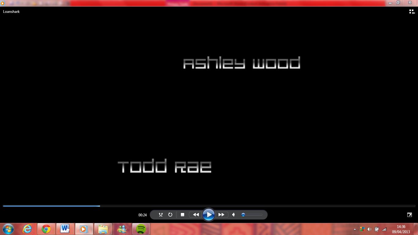
Loanshark...


 Most of the openings I have seen - James Bond, Max Payne, The Dark Knight Rises - all start off with a animation opening, instead of having credits in between action like ours does. We decided to challenge the convention of having credits after an action sequence, and not having an animation,as we liked the idea of have an action sequence with credits as it didn't take away from the action like the James Bond opening can do, as it's very long, colourful and abstract, and we didn't want our
  Music wise we kept to the common convention of our genre and used instruments typically used in music in Action films. The music in the opening of Max Payne uses drums and guitars, it's similar to what we used, we didn't want to challenge this too much, and we developed the convention to suit our film. We didn't want the full on drum & base, loud action music that we typically hear in a action film, we wanted a drum & base with guitar, something that is not too over the top, but fits in well with the film & genre.
Both openings show the gun, which is the main point of the film, what the genre is centred around. In Max Payne, there is an animated gun which spins round, with the titles swirling around, in our opening, we see our main character lifting the gun, about to fire it, with the credits coming after it. Most films use this in their openings, as guns and other weapons are a symbol of action/thriller films, for example, in the opening for the movie Skyfall, there is a shot where you see a shadow of a man, holding a gun, and James Bond is centred around guns, cars and other weapons. It allows us to present the genre to the audience, and to see what could happen.

 Unlike most action/thriller films, we decided to put our film title at the end. The title of Max Payne is in the middle of the sequence, before the actors names come up. We decided against that, however, most films within our genre tend to put the actors names first then the crew members names, the film Max Payne does this differently, they put the crew members names first, then the actors. We decided to do it following the convention of most films, having the actors names first, then the crew members - Director, Writer, Music Producers etc. We decided to use this convention rather than challenge it, as it made sense when we were editing it.
Finally, we kept to the stereotypical storyline, our film is very similar to 'Max Payne' in the sense that he has a goal, to kill the enemy. Every action film has a goal that the main character sets him or her self, our film is no different in this respect. However we have tried to portray this typical storyline in other ways, and not copy other action/thriller films with a similar story line.

No comments:
Post a Comment